
-p-1080.jpg)

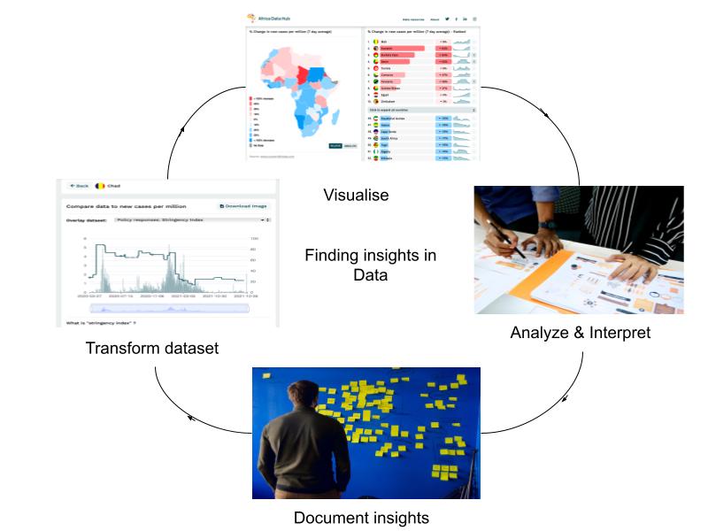
These 5 steps are based on the Data Journalism Handbook, from the section Using Data Visualisation to Find Insights in Data.
Together with the COVID 19 Resurgence dashboard, we hope to support you in being a sense maker for your community and readers - so that you can find and transform the insights from data into meaningful stories.
1. Write down your question and declare your assumptions.
The first thing we will do is write down our questions and our expectations or assumptions about this dataset.
- What do you hope to find?
- What do you believe is happening with new cases in your country/region?
Answering these questions will help you be aware of any biases you may have and serves to reduce the risk of misinterpretation of the data caused by those biases.
You've made yourself aware of your beliefs about this sort of data, and when you're in the analysis stage of this process, this awareness will help you analyse the data more accurately.
For example, I have a question: "Are the current lockdown regulations (level 1 - low) impacting the number of new confirmed cases of COVID-19?" I have current assumptions that stricter lockdown regulations lower the number of new cases.
2. Visualise
After you've documented your thoughts and expectations about the data, you begin the investigation by selecting how you want this data to be filtered; country, time, with additional comparison metrics overlaid.
You can start your inquiry by filtering the data according to what interests you. Alternatively, you can explore the data in its default settings.
Tip: I've chosen to view the data for a country that I'm familiar with to sense-check the information presented while still learning how to use the tool.
Once you have selected it, the dashboard will transform to show you the data according to your filters. We offer 3 types of visualisation tools for this data - choropleth map, leaderboard, and the area graphs.
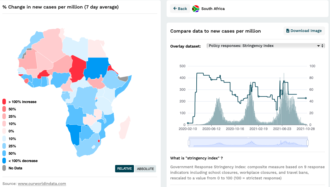
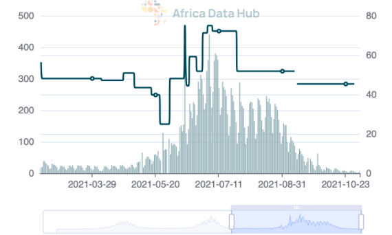
Continuing with our example, I have chosen to view the new confirmed cases per million overlaid with the stringency index (a measure of the lockdown regulations) for South Africa. This selection is shown in the image above.
3. Analyse and Interpret
The next step is to learn something from the picture you have created. To do this, you can ask yourself the following questions:
- What do I understand from this data view? Is it what I expected?
- Can I see any interesting patterns?
- What might this mean in the context of the data?
What do I understand from this view?
- Earlier in the pandemic (March - June 2020), stricter policies and lockdown measures were in place.
The line showing the stringency index sits above 80% during this time. This is what I expected to see. The South African government's motivation for stringent lockdown measures was to "flatten the curve" and allow enough time for hospitals and care facilities to prepare enough space and equipment.
- The lockdown regulations have relaxed over time, dropping below 30% in May 2021.
The restrictions have not been as strict as they initially were, even though the number of cases per million has exceeded the peaks of the first wave.
Can I see any interesting patterns? I can see that South Africa had three waves - that each subsequent wave was more significant than the last. The stringency index appears to shadow the surge in new confirmed COVID-19 cases during the second wave, and by the third wave, the stringency index is more closely aligned to the resurgence in new cases.
What might this mean in the context of the data? Earlier stricter policy measures were not very responsive to the number of new confirmed cases of COVID-19, but they were precautionary, particularly compared to later lockdown measures that responded to surges in cases and local hotspots. As time has passed and healthcare facilities are meant to be better equipped, the South African government's response to new cases, as shown by the stringency index, has begun to track the resurgence in new cases more closely. The severity of lockdown restrictions is more closely linked to the severity of the rise in new cases. While the stringency index shadows the second wave, it almost pre-empted the third wave. This shows that the South African government has become better at relaxing regulations when cases are low and ramping them up when cases are expected to rise.
4. Document your data insights and the steps you took
Documentation is the process of creating a map of your journey through the data and the dashboard. It is also critical that you document how you filtered the data and what insights you got from each data view. As you run different queries on the data, clearly writing down the steps helps you know which filters brought you to the view where you discovered new insights or confirmed what you were looking for.
Here are some questions you can ask yourself:
- Why have I created this chart? What did I want to see/learn?
- What steps have I taken to create this view of the data?
- What does this chart/view tell me?
For example, in documenting how I filtered and produced the chart above I might write:
Why have I created this chart? I created this chart based on South Africa because I know this context and that knowledge would help me contextualise what I was seeing in the data visuals. In addition, a familiar country would help me focus on learning more about how the dashboard works.
What steps have I taken to create this view of the data?
I clicked on South Africa on the map, which changed out the leaderboard to a graph of South African cases. From the dropdown menu I chose the comparison metric - stringency index. I waited for this to be overlaid to new confirmed cases of COVID-10 per million. I also read the footer that explained what the stringency index is to make certain that this is the view I wanted of the data. I then pressed the download image to save the chart for analysis.
What does this chart actually mean?
It shows the number of new confirmed cases of COVID-10 per million (left y-axis) overlaid with the stringency index (a measure out of 100 on the right y-axis) over time (horizontal x-axis).
5. Transform the data
While documenting your insights from the chart or view you created, you might naturally be inspired by what else to look for in the dataset. Possible transformations on the Resurgence Map include Zooming and Filtering.
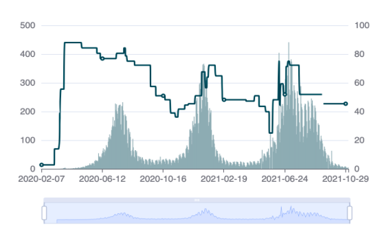
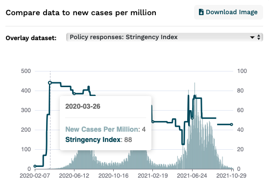
Zooming: you might want to look at a particular detail in the chart. You can do this in two ways on the resurgence dashboard. You can hover your cursor over a point in the graph, and a line will appear along with a card. When I do this, I get a date and a value for the stringency index and new cases per million at a certain point in time.
Alternatively, you can drag the slider below the graph to zoom into different periods. For example, I have dragged the slider to the right, focusing on the third wave.
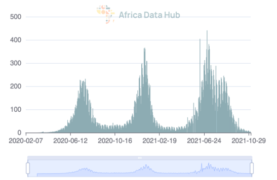
Filtering: you can add or remove datasets that you don't want to focus on in this view. For example, if I wanted to focus on just the new cases of COVID-19 over time, I could temporarily remove the stringency index from this view. Providing us with this view below.
You can then continue the cycle (visualise, analyse, interpret, document, and transform) until you gather the insights you need to tell the stories you want to tell.
Stories I might be able to tell from these insights:
- Compare and contrast similar African countries that varied their stringency policies to countries that did not.
- Contextualise this data with data showing how stringency policies impact the spread of COVID-19.
- Why were there changes in the stringency index
While many international and governmental agencies talk about the pandemic, it is still super valuable right now for local newsrooms to talk about COVID-19. Finding deeper country-specific, regional or continental insights about what is happening around us and how it might affect us helps us make sense of the world.


.png)

