
-p-1080.jpg)

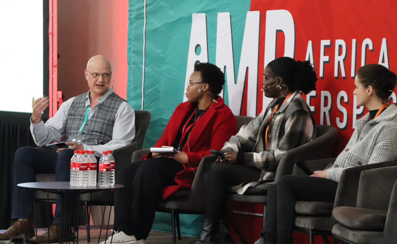
Africa Data Hub hosted a panel webinar on 30 September 2021 with data experts to share the lessons they have learned while building COVID-19 Dashboards for various African and international newsrooms.
The panel included:
- Esteemed data scientist; Samer Ahmed
- The CTO of Odipo Dev Kenya; Adrián Blanco
- A Digital Journalism Fellow at Tow Centre Global; Joshua Olufemi
- Founder and Publisher at Dataphyte Nigeria
- Alastair Otter of Media Hack South Africa
Here are some tips and nuggets of wisdom they shared about creating COVID-19 Dashboards.
Building COVID Dashboards: Lessons Learnt from Open Cities Lab on Vimeo.
The reliance on data and visualisation for journalism
In the wake of the COVID-19 pandemic, field reporting has become very difficult due to movement restrictions. Newsrooms have evolved their storytelling techniques to relay relatable news to their dynamic audience. As a result, there is heavy reliance on data and visualisation assisted reporting as a focal resource for COVID-19 updates.
What are the trends in Data Visualisation?
According to Joshua, in Nigeria and Africa at large, interactive data visualisations for Covid-19 - such as dashboards and trackers - have become more popular to allow for predictive analysis of the pandemic trajectory and drive policymaking.
Whereas, at the beginning of the pandemic, newsrooms mostly used simple graphs, which easily gave the audience an overview of what was going on globally and locally.
Software used to build COVID-19 dashboard projects
Data expert Samer, recommends using Flourish, which has preset templates to create COVID-19 related dashboards.
"Flourish is easy to use, runs fast on mobile - the most common medium the audience interacts with news - and is free. However, it has limitations for designs and templates and is harder to automate than dashboards created from scratch on Javascript," says Samer.
Alastair pointed out that creating a dashboard from scratch is a labour and a capital intensive affair that newsrooms must invest in.
Four tips for creating a useable, valuable COVID-19 dashboard
- Readability: Keep the dashboard simple with few data points to avoid overwhelming the audience with information. Adrián advises that it should be easy for both the audience and journalists to interpret and understand.
- Meaning: For Samer, it is paramount that context is given for every dashboard you create by providing brief explanations of what the data points represent. The more information you can give the audience, the better they understand the message.
- Aesthetic: Avoid having too many data points on the dashboards as they become hard to read/ interact with. Alastair proposes that you use catchy colours that do not irritate the eye; be sure to customise the themes and design to match your news organisation's specificity.
- Verify your data: Joshua reminds us to fact check and verify any information used on the dashboard to build trust with the audience. Remember, all data sets tell parts of a story, and any wrong figure directly translates to wrong projections and changes the narrative.
How to improve your COVID-19 dashboards:
- Ask for feedback from newsrooms to understand what makes a newsworthy visualisation and how to best support their storytelling practices.
- Listen to feedback from the audience to understand the data points they seek to interact with more.
For instance, Samer said he found it helpful to evaluate why and when the audiences interact with local, regional and global data stories. This informs the type of data sets he uses on visuals. It is important to remember that the audience's needs are dynamic, and one must keep up with them.
At the Africa Data Hub, we want to create a space for journalists to share their learnings, experiences and solutions with other journalists and build a sense of community across the continent.

.png)

